Advanced Assessment Methods: Additional Ways to Look at Data

As I continue this blog series on advanced assessment methods for your PA program’s data, I have been emphasizing different ways we can look at sets of data so that we can extrapolate correlations from them. In today’s blog, I will share two more assessments I find valuable: stratification and the heat map. The beauty of these processes is that – assuming there is reliable data within - they are extremely easy to read and understand.
Let us look at the application for these.
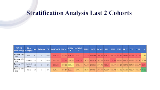
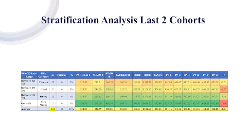
Stratification allows us to differentiate several levels of scoring across a data set. Below, we have the stratification of a program’s previous two cohorts when it came to their PANCE score ranges. Green obviously is good; red is not good. There were eight failures. We can see that PACKRAT I, Summ I, Summ II, and Packrat II, EORE and EOCE test scores across the board are worse for those students who failed. But those twenty-three students that were strong, over 500, their PACKRAT I score was 138, and their PACKRAT II score was 169, versus 103 and 129.
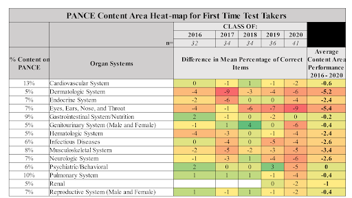
Then, we can look at a heat map. Heat maps are valuable because they let us observe trends over time. This one presents five years of data. You are going to see, for example, the 2020 cohort in this particular program had a low PANCE pass rate, so there’s going to be a systemic lowering of the performance because of that. However, by looking at data over time, you can detect if there is a trend forming.
For example, if you look at ENT, infectious, musculoskeletal, or dermatologic systems, this program has historically performed poorly. That ENT score shows a quite concerning trend downward. We see there is a trend in the neurologic system, going down as well. It is easy to see that these areas require action plans.
So, the program sets the benchmark, and if we look at three years of data, or five years of data, “x” percentage in performance will result in action. I would not recommend that you chase one percentage point. But certainly, five is a good place to start.
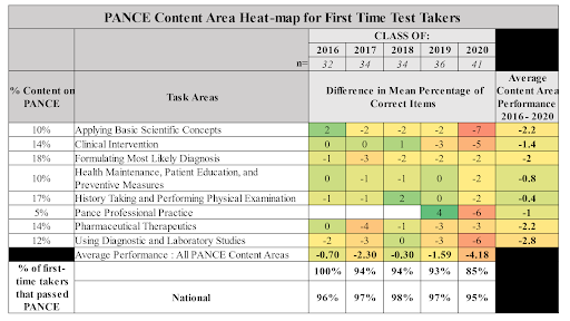
This heat map deals with task areas, once again looking at five years of data. We see that “Applying Basic Scientific Concepts” has experienced a sudden drop. “Clinical Intervention” has experienced a decline over the past two years. “Using Diagnostic and Laboratory Studies” has been problematic a little bit recently. When we observe two years of trends that are going steadily downward, that is a sign that there are performance issues.
So, we have spent the last few blogs demonstrating the usefulness of advanced assessment methods. While advanced assessment is not required by the ARC-PA commission, and while it does not replace the minimum requirements as defined by Appendix 14, they are beneficial because:
- They enhance the programs’ ability to identify areas in need of improvement.
- They let you take the next step toward seeing how your data is interrelated.
- They allow you to identify curricular modifications beyond typical descriptive or causal relationships.
Now that we have established the value of advanced assessment, it is time to get to the point and explain how to do it. In my next blog, I will begin by showing you some of the best statistical tools for looking at your data.
